Mist of Noosa brand guidelines
Brand guidelines
How to use these guidelines
These guidelines are for anyone putting the Mist of Noosa name on something, whether that’s Jayke and Fernando, the team at Kit & Cub, a printer, a Shopify developer, a photographer or a creator filming in their own kitchen.
This first version covers the heart of the brand: who it’s for, how the name and the mark are drawn, the typeface and colours, how we talk, the range, and how we photograph it. Packaging comes next. We’ll add it once the bottle, cap and finish are settled with suppliers.
There aren’t many rules, because a quiet brand doesn’t need many. If you’re stuck on something these pages don’t cover, picture a designer walking you through their studio and ask whether they’d do it. When something starts to feel loud or rushed, it has usually drifted away from Mist of Noosa.
If you only have a minute, the next page puts the whole brand on one screen.
The brand on one page
This is the short version, for a printer, a developer or a creator who needs to get started. Each part is explained properly further down.
For people who have put care into their homes, Mist of Noosa is an Australian home fragrance, poured by hand in Noosa, that makes a room feel as good as it looks.
The Creator, kept warm by the Caregiver.
Made with real care, and understated enough to suit any room it’s in.
The three O’s, lifted straight out of the name. People find the connection for themselves, so we leave it unsaid.
Sand, sea mist, stone, charcoal and eucalyptus. Pages sit on off-white or charcoal, and the other colours are used as accents.
Warm and considered, and never in a rush.
It shouldn’t sound casual, homespun or cold, and it never uses words like cheap, ordinary or basic.
A scent for home that takes you away.
The first thing a guest notices when they walk into a room.
The brand
For people who have put care into their homes, Mist of Noosa is an Australian home fragrance, poured by hand in Noosa, that makes a room feel as good as it looks.
Jayke and Fernando put it best: “We don’t just sell room sprays. We help people create a space that they will never want to leave.” Everything in these pages is here to help with that.

The Creator, kept warm by the Caregiver
The Creator cares about craft and making things that last. The Caregiver keeps that warm, so the brand earns trust through quality and then looks after the person in front of it.
A home that is looked after
People want their home to feel calm, and to look, feel and smell cared for. We give them something well made that helps with that.
Noosa as a feeling
We draw on the Noosa that locals know: soft morning light, low tide, linen and sand, the national park after rain. Surf kitsch and Aussie shorthand don’t belong here.
Three buyers, each after something different
The holiday rental manager
Scents that smell great and suit any style of apartment.
The hotel purchasing manager
A scent that adds to their hotel’s own brand and gets guests asking what it is.
The home owner
Something beautiful on the table, and a home that feels good to be in.
We look to Skandinavisk for place-led names and simple lines, Humdakin for the story closest to ours, and Aesop for the way it shows craft without making a fuss. Balmain Body and boutique hotel amenity lines are the shelf we want to sit on.
Dusk, and anything mass market, promotional, discount-led or brightly coloured. If an idea would sit comfortably in a Dusk store, it’s the wrong idea for us.
The wordmark
The wordmark is set in Euclid Circular A, a geometric sans built from circles and straight lines. Its O is a true circle, and that’s where the mark comes from.
The stacked version is the main one, and it always stands on its own because the mark is already inside it. For narrow spaces there’s a single-line signature, which is always led by the mark. We write the name out in full every time, so there’s no monogram.
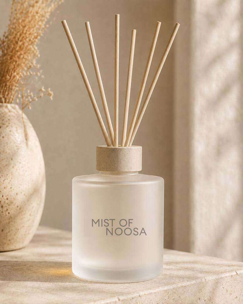
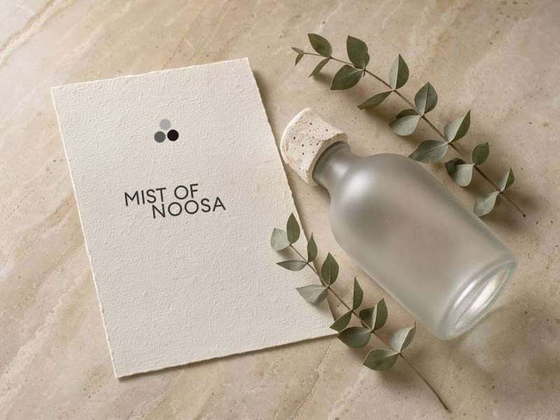
A · Stacked wordmark. The main version, used on the bottle, the website header and in print.
Reversed. Off-white on charcoal, kept as a flat colour without tints or gradients.

B · Centred stack with the mark. For tall, narrow spaces like bottle fronts, social avatars, tissue stamps and swing tags.

C · Signature. The mark leading the name on one line, for the mobile header, email footers, wholesale paperwork, invoices and the base of the bottle.
Clear space and minimum size
Leave a margin around every version that’s at least the cap height of the letters (the height of the M), and keep text, edges and other logos out of it.
The stacked wordmark shouldn’t go smaller than 28 mm wide in print or 120 px on screen. Any smaller than that, use the signature or the mark on its own.
Use the artwork files as supplied. The letter-spacing and the offset of the second line are set and shouldn’t be adjusted.
Use charcoal or off-white only. On a scent’s own tint, pick whichever of the two reads more clearly.
Put circles inside the letters, make the O’s heavier or draw attention to them in any other way. It’s nicer when people discover the three O’s for themselves.
Put the mark next to the stacked wordmark. The three O’s are already in the name, so it ends up saying the same thing twice.
Shorten the name. It’s always Mist of Noosa in full.
Retype it in another weight, add a tagline to the lockup, or outline, shadow or skew it.
The mark
When the name is stacked on two lines, the O in of sits right above the gap between the two O’s in Noosa, and the three of them form a neat triangle. The mark is those three circles, lifted out exactly where they sit.
We kept the same circles and the same spacing and filled them in, so the mark and the name will always match. They’re never layered over each other. The mark sits beside or above the name, or on its own.
The mark does the more visible jobs so the wordmark can stay quiet. It shows up on the scent notes, the cap, the favicon, the loader, seals and carton tape. People get to know the shape from those places, and one day they spot it in the name.
Lifted from the name
The circles and spacing come straight from the wordmark and are filled solid, so the two always match.
Proportions
With the circle at 1, the horizontal pitch is 1.19 and the vertical drop is 1.12. The O’s don’t touch, and the 0.19 gap keeps each one whole.
Works at any size
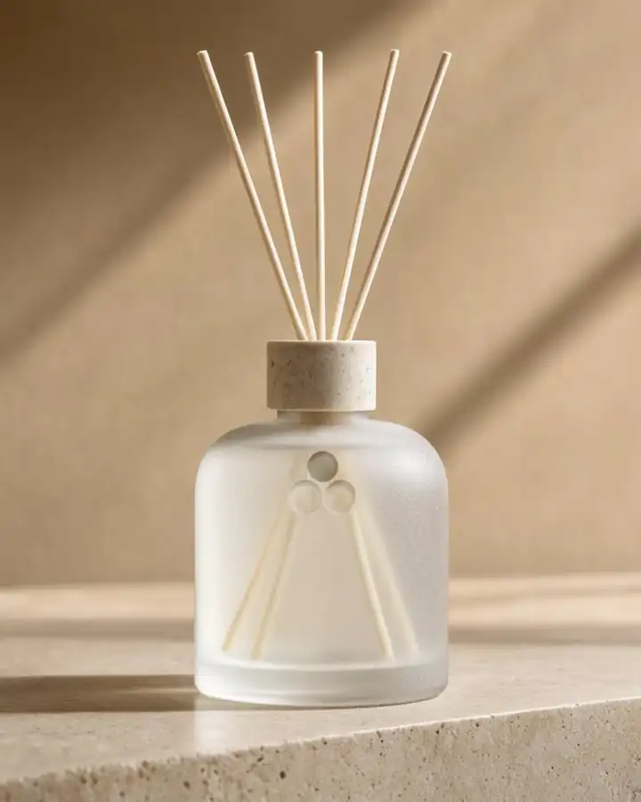
One circle above two. It’s simple enough to etch into glass, deboss into stone or sit at 16 px in a browser tab.
This diagram is only here to explain the idea. Please don’t show the wordmark this way anywhere else.
The mark comes out of the name, and we haven’t changed the wordmark to point at it. The O’s are the same weight as every other letter, nothing is drawn inside them, and we never stage a “did you notice?” moment. Someone who spots the connection gets a small, private pleasure from it. Someone who doesn’t has still seen a well-made name and a well-made mark.
Don’t place the mark over or inside the wordmark, animate one into the other, or explain the idea in customer-facing copy. The story of where it comes from belongs in this document and in conversation. Everywhere else, it’s just the mark.
The circles are always filled. There’s no outline, overlapping or blended version, because solid circles hold up at 16 px and etch cleanly into glass.
Primary, three tones. The light circle sits above the two darker ones. Use it for web, print and signage.
Reversed. The top circle is still the lightest.
One colour. For etching, debossing, foiling and stamps.
16 px on screen and 4 mm in print. It’s solid at every size, so there’s no stroke to thin out. Leave one circle’s width of clear space around it.
Every fragrance is built in three layers. The top note is what you smell first, the heart opens up after that, and the base is what lingers. The three circles hold those notes for each scent on its card, on the bottle and on the website. We let people see the idea without spelling it out.
Top, heart and base, with the fill getting darker from top to base the way a fragrance settles.
Debossed into the cap and etched under the base, where you only find it when you pick the bottle up.
It’s the favicon at 16 px. The site loader is the solid mark turning once, easing in and out with a slight outward push at full speed, and each turn takes under two seconds. It doesn’t animate into the wordmark.
The solid mark inside a ring that reads Mist of Noosa · Noosa · Queensland · Australia. It’s etched under the base and pressed into tissue stickers and box closures.
Carton tape printed with the mark on repeat, so a hotel knows who it’s from before the box is open.
Three or four well-chosen places is plenty. Any more and it starts to feel like wallpaper. If the mark is already on the object, leave it off the label.
Typography
We use Euclid Circular A, by Swiss Typefaces, for everything.
It’s one typeface in three weights. Light is for headlines, Regular is for reading and Medium is for labels and prices. Hierarchy comes from size, weight and space, so there’s no need for a second font, bold or decorative italics.
Mist of Noosa holds a licence for Light, Regular, Medium, SemiBold and Bold, with italics, but we only use the first three. Where Euclid can’t load, like in email or some documents, use Helvetica Neue or Arial instead of another geometric font.
Set headlines tight, at around 1.0 to 1.1 line height, and give body copy room at 1.5. Uppercase labels get 0.1 to 0.14 em of letter-spacing, and sentence case doesn’t need any.
Scale the same ratios down for print. On the bottle, the scent name is the biggest thing after the wordmark, and the fine print needs to stay readable at 6 pt.
Colour
The palette is soft and natural, which leaves room for each scent’s own tint to stand out.
Pages sit on off-white or charcoal, and the two take turns so you don’t get two of the same in a row. Sand, sea mist and stone are for panels, labels, tissue and cards, and charcoal does the job of ink. Eucalyptus is the one accent. Save it for small touches like a link, a line on a label or the thread on a swing tag.
Off-white #FBFAF7 for almost everything, and charcoal for the moments that need more weight, like a dark page on the site, the inside of a lid or the cover of a hotel one-pager.
Use charcoal text on off-white, sand, sea mist and stone, and off-white text on charcoal and eucalyptus. Eucalyptus works as text on off-white or sand, at label size or larger.
On light backgrounds the top circle is #A9A9A9 and the two below are #5C5C5C and #1A1A1A. On charcoal they’re #EDEDED, #A0A0A0 and #6A6A6A. These stay the same for every scent.
Each fragrance will get one tint from the same natural family. We’ll choose them alongside the packaging, once we know how each scent will be told apart. Until then, all five use sand.
We’ll add CMYK and Pantone values with the first print job, matched on press instead of converted on screen.
Voice
Mist of Noosa sounds like an Australian designer showing you around their studio. There’s the care for craft you’d find in Copenhagen, and the easy warmth of a boutique hotel owner who’s happy to see you walk in.
It cares about how things are made and just as much about the people they’re for. It’s happy to tell you about the oils and the process, and it trusts you to make up your own mind.
Considered
We choose our words carefully and talk about real things, like the oils, the notes and how it’s made, instead of reaching for adjectives.
Knowing
We know this stuff well, and we share it the way you would with a curious friend, without lecturing.
Calm
We take our time. We don’t chase people or raise our voice to make a sale.
Warm
We talk to people about their homes like a neighbour who happens to know a lot about fragrance. We’d rather say a little more than sound clipped or clinical.
Copy that sounds too casual, homespun or cold, or like a market stall. We don’t call ourselves luxury, because the product should make that clear on its own. And we don’t use the words cheap, ordinary or basic, about us or anyone else.
Approved headlines
A scent for home that takes you away.
The hero line, for the homepage, launch campaign and gift card.
The first thing a guest notices when they walk into a room.
For wholesale and hospitality, where it works best said simply.
Use these as headlines, for the hero, a campaign or the inside of a lid. They aren’t body copy, and they don’t go under the wordmark as a tagline.
Voice in practice
Here’s some of the earlier copy rewritten in the new voice. The facts haven’t changed and the warmth is still there, with fewer adjectives doing the work.
Bring the essence of Noosa into your home, where salt-kissed air, sun-warmed woods and soft coastal florals come together in perfect balance. Our carefully curated scents are crafted to shift energy, soften stress and bring a sense of effortless coastal luxury into every room.
We make five room mists here in Noosa, poured by hand in small batches from good oils we’ve taken the time to blend properly. They’re made to linger, so the room still smells lovely when friends come over that evening. A spray or two as you walk in the door is usually all it takes for the place to feel looked after.
Unapologetic radiance. Main-character energy, strutting down a sun-drenched beach with zero insecurities, wrapped in a warm, buttery wave of self-love.
Siesta opens with pistachio and almond and settles into salted caramel and sandalwood. It’s the cosiest of the five, the one for late afternoons when the shoes are off and there’s nowhere you need to be.
Say
Avoid
Start with the note line, then a few sentences about the room and the moment it suits, then how to use it. Aim for around 80 words, written the way you’d describe it to a friend in the shop.
Just the name, note line, product and size. The mood and the story go on the card.
Cover what it is, how it’s made, what it costs and when it ships, in short paragraphs. Let the facts do the selling.
Keep captions to a line or so, relaxed but properly punctuated, and let the photo carry the post. Leave hashtags out of the caption.
The range
Each scent has a one-word name that describes a moment or a place. We’ve kept “Noosa” out of the names, since the brand name already carries it.
Two names are confirmed. The other three are proposals in the same spirit, each a moment or a place with a little of the Mediterranean about it. The three circles hold each scent’s top, heart and base notes.
| Name | Was | Top | Heart | Base | Status |
|---|---|---|---|---|---|
| Apero | Noosa Crush | Dragonfruit, lychee | Brazilian jasmine, ocean air, hibiscus | Warm vanilla, musk | Confirmed |
| Nativa | Noosa National Park | Lemon, pine needle | Eucalyptus, lemon myrtle | Patchouli, sandalwood | Confirmed |
| Vesper | Madam Noosa | Sparkling orange, bergamot, grapefruit | Jasmine, rose lychee | Patchouli, vetiver, vanilla, musk | Proposed |
| Lido | Noosa Coco Lime | Lime, lemon zest | Coconut, verbena | Coconut cream, vanilla | Proposed |
| Siesta | Noosa Nude | Pistachio, almond | Heliotrope, jasmine petals | Warm vanilla, salted caramel, sandalwood | Proposed |
Vesper is the evening hour and the drink that goes with it. Lido is a resort beach, bright and easy. Siesta is the slow, warm middle of a hot afternoon. We’ll run a trade mark search in classes 3 and 4 on all five before artwork goes to the supplier. Apero is written without the accent.
The scent name comes first, then a three-word note line with one note from each layer, then the product and size. Descriptions of mood belong on the website and the card, and stay off the glass.
The 100 ml room mist, the 100 ml and 200 to 250 ml diffusers, and the 50 ml body spray coming later all share the same name, mark and note line. Anything we design for one product should work on all of them.
Photography
We photograph two things: the homes our bottles live in, and the Noosa they come from.
That means beautiful interiors, and the river, the headland and the beach in good light. Keep it honest. When a shot has been set up to look spontaneous, it usually shows.





Reference images from Unsplash, for direction only, by Timothée Duran, Leon Alexandre Schouller, Raygar He, Cat Han, Clay Banks, MC Kontext, Dillon Hunt, Bailey Rytenskild and Darren Kearney. They’ll be replaced by our own product shoot.
Light
Soft, natural light from one source, early or late in the day, so the shadows fall long and gentle. Steer clear of flat, catalogue-style lighting.
Subjects
Interiors that are already well looked after, like a table, a shelf, a hotel vanity or the bottle sitting on stone or linen. And Noosa itself (the river mouth, the national park, Main Beach early in the morning) seen the way a local sees it.
What to leave out
Anything that feels like a tourism brochure or a surf brand, kangaroos, props set up to look casual, or the bottle plonked on a beach. For our customers the coast is home, and we photograph it that way.
Keep saturation low and the neutrals warm, so the photos sit in the same five colours as the rest of the brand.
Creator content follows the same rules, a little more loosely. Ask for real homes, daylight and the bottle being used, and brief creators to keep it calm and unscripted.
Digital
Most people will meet Mist of Noosa online first, so a few rules for the store and social are set now. The rest will follow once the Shopify design is done.
The stacked wordmark on desktop and the signature on mobile, the same as this page, in charcoal on an off-white bar. The header stays in those two colours.
Use the loader from this page, where the mark turns once with a slight outward push and each turn takes under two seconds. The favicon is the three-tone mark on off-white at 16 and 32 px.
Buttons have square corners, with either a charcoal fill and off-white text or a fine outline. Links are eucalyptus and only underline on hover.
Product shots are 4:5 and lifestyle shots are 3:2. Show one photograph at a time where you can, and leave carousels off the homepage.
The avatar is the centred stack with the mark, on sand. The grid alternates between a photo and a typographic post, and Stories use the same palette without stickers.
Put the signature at the top, set the body in Helvetica Neue, and use an off-white background with a sand panel where it helps. Each email gets one image, one message and one button.
In the world
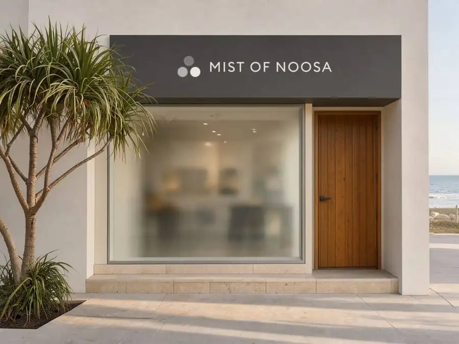
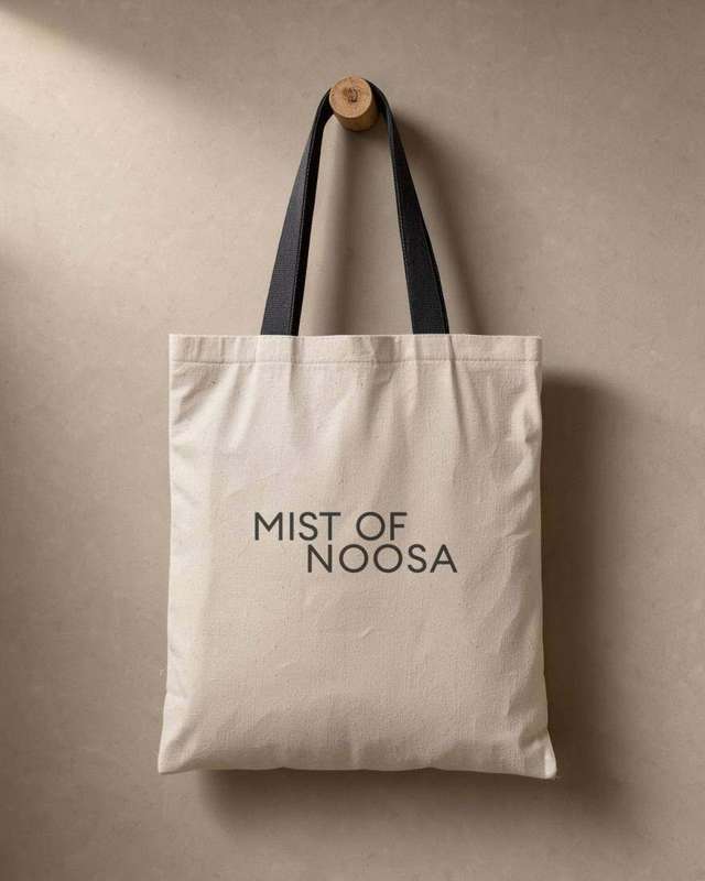
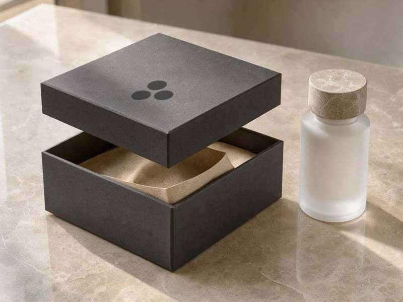
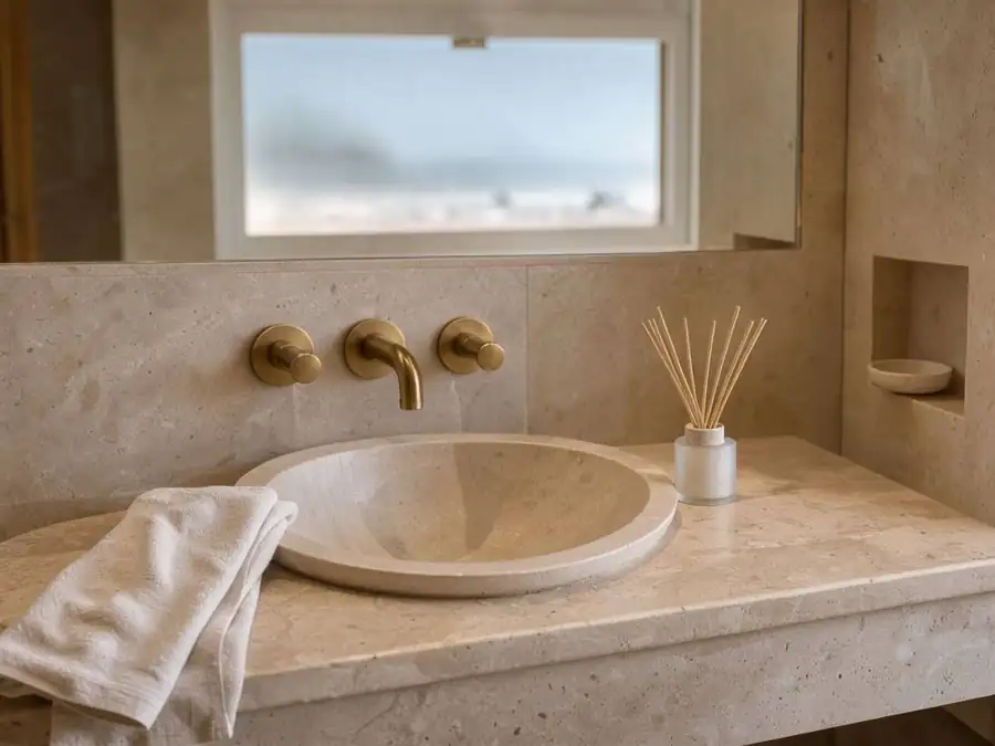
This is how it all comes together off the page, on a shopfront, a tote, a gift box and a hotel vanity.
We use the same few pieces each time: the signature on the shop sign, the stacked wordmark on fabric, and the mark on its own where the name is already close by. Nothing is added just to decorate. These are concept images made for direction, not supplier samples.
Files and version log
In the Mist of Noosa › branding folder, which Kit & Cub looks after and shares with the founders. Final artwork comes as SVG and PDF, plus PNG at 1x and 2x for screen.
MoN_wordmark-stacked_charcoal.svg, MoN_wordmark-stacked_white.svg, MoN_signature_charcoal.svg, MoN_mark_3tone.svg, MoN_mark_mono.svg. Everything after the prefix is lowercase, with hyphens between words and underscores between parts.
Mist of Noosa holds the desktop and web licences for Euclid Circular A. Please don’t send the font files to suppliers. Send outlined artwork instead.
Jonathan Edmeades at Kit & Cub Creative, jonathan@kitandcub.co
- v1 · 28 October 2026
- Core identity: brand, wordmark and lockups, the mark, typography, colour, voice, range names, photography direction, digital basics. Packaging to follow in v2.
- v1.1 · 5 November 2026
- Larger type for easier reading, faster loading, and the copy rewritten in a warmer voice.
- v2 · pending
- Packaging, covering the bottle artwork, cap, label or etch spec, box, discovery set, tissue and carton. Also the scent tints, the final names, and photos from our own shoot in place of the reference images.